126 (edited by KRGraphics 2016-10-18 12:59:52)

Re: Project Champion

christougher wrote:

This has obviously been very frustrating for you. My approach to UFE has been to add everything I use into the existing UFE stage so as to compare them.  I cannibalized the floor plane even. I resized my characters based on how they compared to the existing UFE characters in game. Clearly not your approach as you focus on creating (gorgeous) assets first and foremost.  Still I would recommend dragging and dropping your assets directly into an otherwise empty scene with the training room prefab and adjusting it to fit around that.

It's been pissing me off for weeks... and I see that the training level stage is scaled up 10x is size... so I'll do just that. I just hope my animations are not affected. I'm also having animation issues that I'm trying to iron out as well, particularly with the blending of punches and strikes. I may have to exaggerate my animations so they read better.

NOTE: This should be mentioned in the manual. Not all of us are proficient in 3d modeling. My background is modeling for CG

127 (edited by KRGraphics 2016-10-19 10:10:56)

Re: Project Champion

So upon the new scaling tweaks, the characters don't pop into the air as much on a single jab... but I am still going to attempt to use my custom falling animation which is just a fainting animation... I will post with my findings. I need to find a way to get rid of the popping in the air on a single jab... there is no reason for this... I just want the character to faint.

Re: Project Champion

[media]https://youtu.be/niTx3xeevDU[/media]

Hey guys... just dropping in a quick demo before I hit the hay. In this demo, i have added some visual polish and smoother animation, though some of it doesn't feel smooth to me. I am also using the new Post-effects profiles that will be coming to Unity 5.5 (looks like I found a way around the camera prefab issue after all) and it looks so impressive. Still more to do... enjoy.

Re: Project Champion

Art Dump:

Blade

These are in engine renders.

https://dl.dropboxusercontent.com/u/158971/Blade-Final-Game-Render.png
https://dl.dropboxusercontent.com/u/158971/Blade-Final-Game-Render-Shaded.png
https://dl.dropboxusercontent.com/u/158971/Blade-Final-Game-Render-WireFrames.png
https://dl.dropboxusercontent.com/u/158971/Blade_HeadShot_Textures.png

Re: Project Champion

Damn, THAT'S some detail.

Share

Thumbs up Thumbs down

Re: Project Champion

Meractus wrote:

Damn, THAT'S some detail.


Thanks man... I will be putting up shots of the characters in the coming days... I needed a break from animating to work on my demo reel

Re: Project Champion

Wow good 3d models!✌✌ keep up!

Share

Thumbs up Thumbs down

Re: Project Champion

Another Art Dump

Blade (Dark Mercenary). I am glad UFE allows Alternate Costumes... I can have as many as I want.

https://dl.dropboxusercontent.com/u/158971/DarkMercenaryTextured.png
https://dl.dropboxusercontent.com/u/158971/DarkMercenaryShaded.png
https://dl.dropboxusercontent.com/u/158971/DarkMercenaryWireframe.png

Re: Project Champion

Hey guys, just wanted to check in on something that I've been dealing with. Is there a fix for the Stand up animation at the start of a new round? I don't want to use a fade to hide the fact the models can't stand up properly. And the model is already down at the end of a round. My goal is to kero the fight seamless like MKXLand Injustice

Thank you much.

Re: Project Champion

Meractus wrote:

Ok, I have checked out the code looking for the Stand Up animation problem.

There are only 2 ways in UFE that will send the character to the "Down" state (only way to trigger the Stand Up animation):

1 - Opponent Override; and
2 - Force applied on the Y axis.

I have tested the value 0.0001 on the Y axis of the: Move>Active Frames>Force Options>Opponent, so I believe this will work for the real world scale that you are trying to achieve.

I believe you can have any value that is higher than 0, as small as it might be (0.0000001 for example, might still work, but since I haven't checked the variable size I can't confirm =P).

I hope an update will add a third state to trigger a stand up animation, at the end of a round. There is no reason for this

136 (edited by Skitz 2016-11-24 13:48:09)

Re: Project Champion

Those models look excellent. I like how the stages are super clean looking. What type of play-style are you going for? Or are you experimenting at the moment.

Share

Thumbs up Thumbs down

Re: Project Champion

Right now I'm experimenting, but my play style is close to Tekken. I'm currently putting together the second character in the game and preparing her for animation.

Re: Project Champion

Hey guys... just posting an update to give everyone a close look at the characters...

Blade

[media]https://www.youtube.com/watch?v=8tjK6ZXcfY4[/media]

[media]https://www.youtube.com/watch?v=6BAn53Hsf3s[/media]

Aiko

[media]https://www.youtube.com/watch?v=56138MH7z3U[/media]

I have been dealing with a lot of technical issues during development and am slowly getting back on track... I do have a question in regards to modifying some of the hit reaction stuff... I don't have UFE Source (yet), but I have an idea on adding a fall down reaction after a knockback... if you play games like MKX or Tekken you will notice that they have animations and fall states for launchers.

I want to ensure I have this in my game since all of the characters will share the general hit reactions.

Re: Project Champion

So what's your question?

Share

Thumbs up +1 Thumbs down

Re: Project Champion

MrPonton wrote:

So what's your question?


My question is how could add a fall state for the knockback... example, if you play with Paul Phoenix in Tekken and perform his "Phoenix Smasher", the opponent flies back and then rolls... When I set up my knockback moves with some force on the Y, the knockback animation doesn't play completely, it will blend into the Default Fall State which is what I don't want...

Re: Project Champion

If your issue is that it's cutting off the animation, that's because the system has already registered the player was "down" and is getting them up.

Add more frame advantage on hit and you'll see it will cut off that animation later.

Share

Thumbs up Thumbs down

142 (edited by KRGraphics 2016-12-07 23:05:19)

Re: Project Champion

MrPonton wrote:

If your issue is that it's cutting off the animation, that's because the system has already registered the player was "down" and is getting them up.

Add more frame advantage on hit and you'll see it will cut off that animation later.

Example, setting it to some obscene number like +90... I will give that a try.

So that failed... I have the frame advantage to 120...

Re: Project Champion

KRGraphics wrote:
MrPonton wrote:

If your issue is that it's cutting off the animation, that's because the system has already registered the player was "down" and is getting them up.

Add more frame advantage on hit and you'll see it will cut off that animation later.

Example, setting it to some obscene number like +90... I will give that a try.

So that failed... I have the frame advantage to 120...

Which is typically a second and a half. It might only work for throws... that's when I had the issue you had.

Share

Thumbs up Thumbs down

Re: Project Champion

MrPonton wrote:
KRGraphics wrote:
MrPonton wrote:

If your issue is that it's cutting off the animation, that's because the system has already registered the player was "down" and is getting them up.

Add more frame advantage on hit and you'll see it will cut off that animation later.

Example, setting it to some obscene number like +90... I will give that a try.

So that failed... I have the frame advantage to 120...

Which is typically a second and a half. It might only work for throws... that's when I had the issue you had.

And that is sad as hell... has anyone played Tekken or MKX... you will see this quite often sad

Re: Project Champion

What's up guys... just posting an update for my game this evening... since Unity 5.5 dropped, I wanted to improve the lighting quality in my game and I think this looks magnificent, especially with Full HDR. And a special note for these shots, the directional light for this is disabled. The world is lit by the IBL.

This one is the toughest for me... lighting sunsets and nighttime levels. I will need to do more research of this...
https://www.dropbox.com/s/avqjdrjgppm6k9g/Screenshot%202016-12-08%2023.55.05.png?dl=0

And the rest.

https://www.dropbox.com/s/xcwa0t9pn2mugfa/Screenshot%202016-12-08%2023.56.53.png?dl=0
https://www.dropbox.com/s/4m6k7o8rv8da8he/Screenshot%202016-12-09%2000.40.09.png?dl=0
https://www.dropbox.com/s/ww6vs50x2rl0j9u/Screenshot%202016-12-09%2000.53.54.png?dl=0

And I will make this even more interesting with a demo.

[media]https://www.youtube.com/watch?v=gjG6TnoYH8w[/media]

Enjoy. Still more to come.

Re: Project Champion

Hey guys... It's been a while since I've updated my project. Doing a lot of work on this behind the scenes and improving on animation quality and character details. In the following videos, I was doing some testing on the Immortal Valley level and seeing how it would look with all of the effects and shader details applied. There is no GI in these scenes since that takes the longest to bake and to run this game in all of it's glory, I will need to build a stronger system.

Stay tuned. There is more stuff coming up, including mocap animations and facial testing for my pipeline using the kinect to track facial shapes.

[media]https://www.youtube.com/watch?v=RBr-mfRoBzs[/media]

[media]https://www.youtube.com/watch?v=SP8m_cS-eRo[/media]

Re: Project Champion

KRGraphics wrote:

Hey guys... It's been a while since I've updated my project. Doing a lot of work on this behind the scenes and improving on animation quality and character details. In the following videos, I was doing some testing on the Immortal Valley level and seeing how it would look with all of the effects and shader details applied. There is no GI in these scenes since that takes the longest to bake and to run this game in all of it's glory, I will need to build a stronger system.

Stay tuned. There is more stuff coming up, including mocap animations and facial testing for my pipeline using the kinect to track facial shapes.

[media]https://www.youtube.com/watch?v=RBr-mfRoBzs[/media]

[media]https://www.youtube.com/watch?v=SP8m_cS-eRo[/media]

That stage looks amazing no doubt! smile

Share

Thumbs up Thumbs down

Re: Project Champion

There is still more to be done... I still need to add grass and trees in here... I also had the skies redone so they look and feel realistic. There is also a daytime version of this stage.

Re: Project Champion

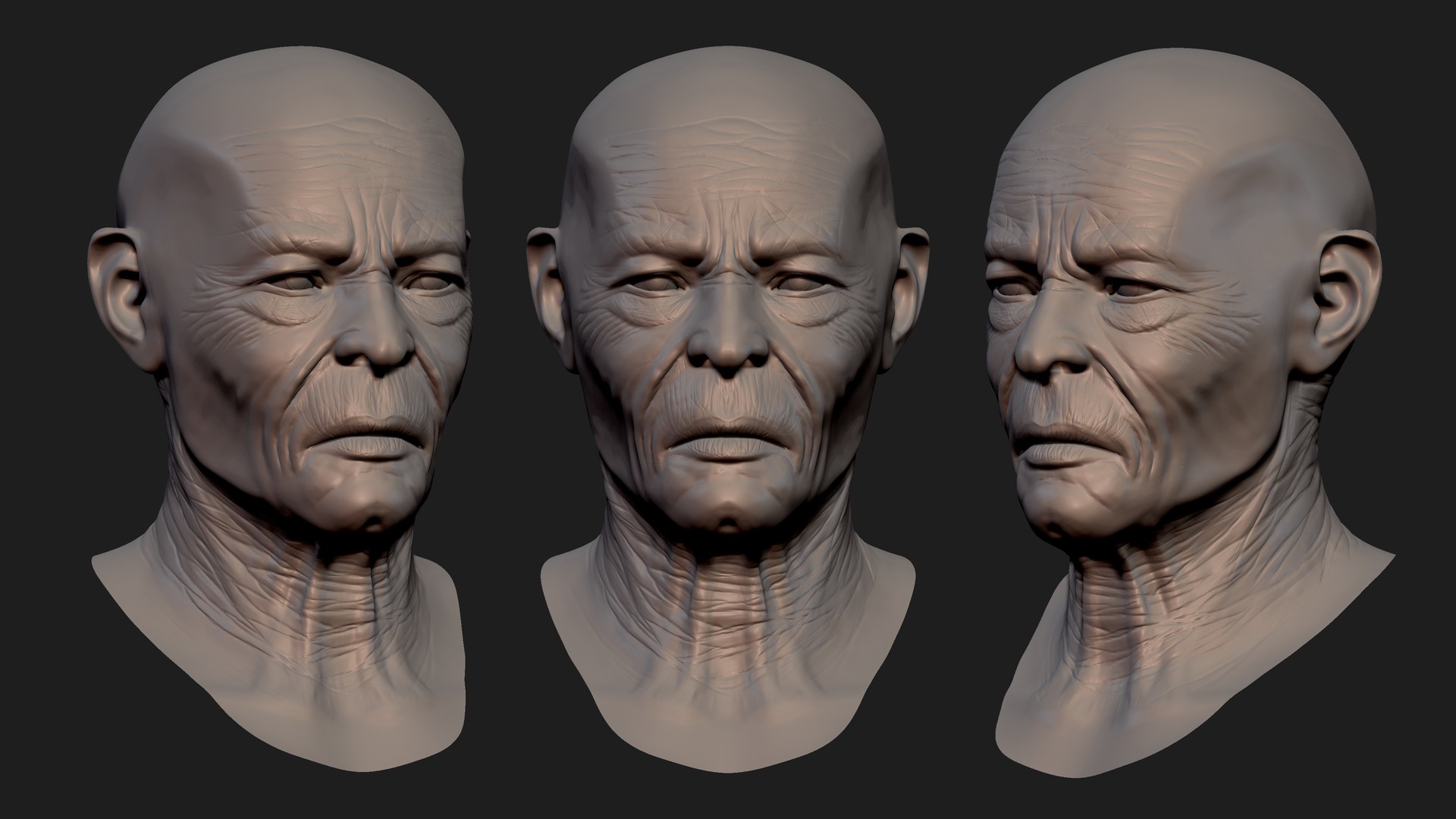
Hey guys... is has been a while since I've posted here... wanted to give you a sneak peek of a new character that I have been working on for the game... he is already done but these are older shots just to give you an idea what to expect... I am also looking to acquire motion capture for the game to design all of the combos and intro moves...

Hope you like the screenshots.

https://cdnb.artstation.com/p/assets/images/images/006/094/879/large/kashif-riley-xavier-pendragon-detail-render.jpg?1496027688
https://cdnb.artstation.com/p/assets/images/images/005/990/379/large/kashif-riley-asset.jpg?1495215463

150 (edited by KRGraphics 2017-09-06 22:02:16)

Re: Project Champion

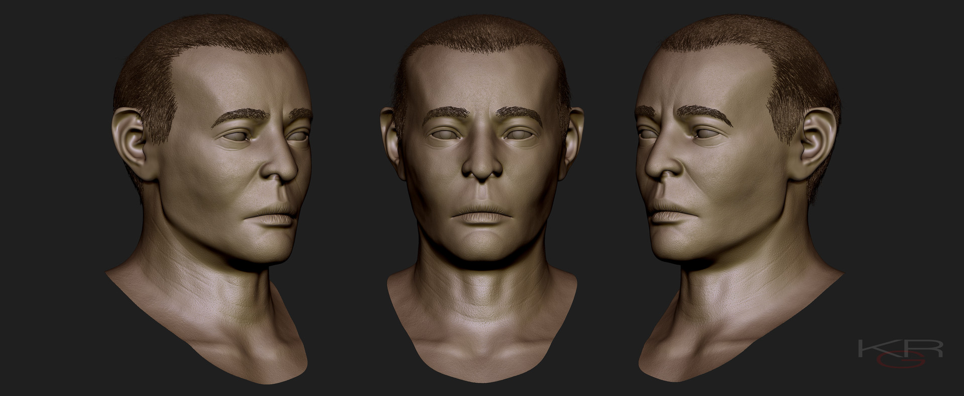
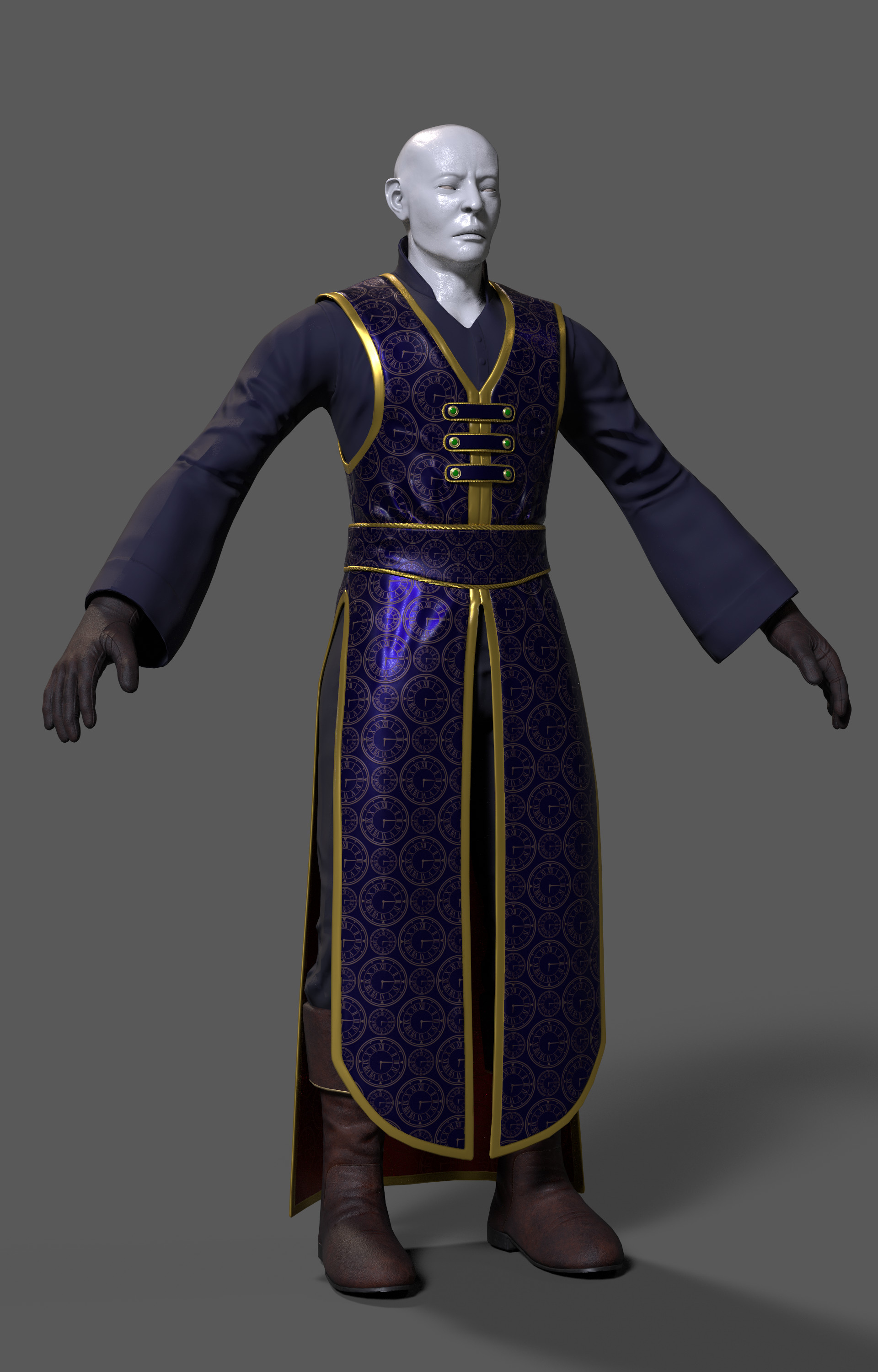
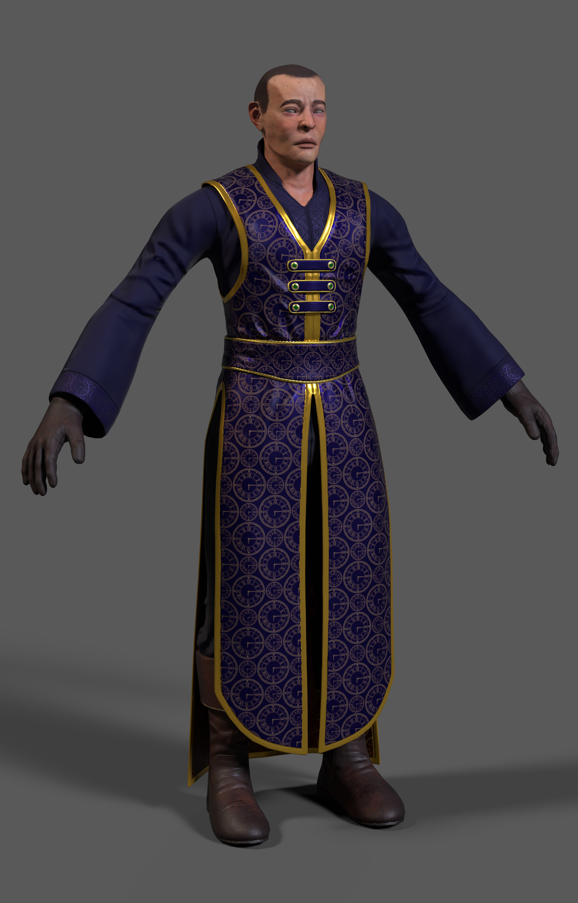
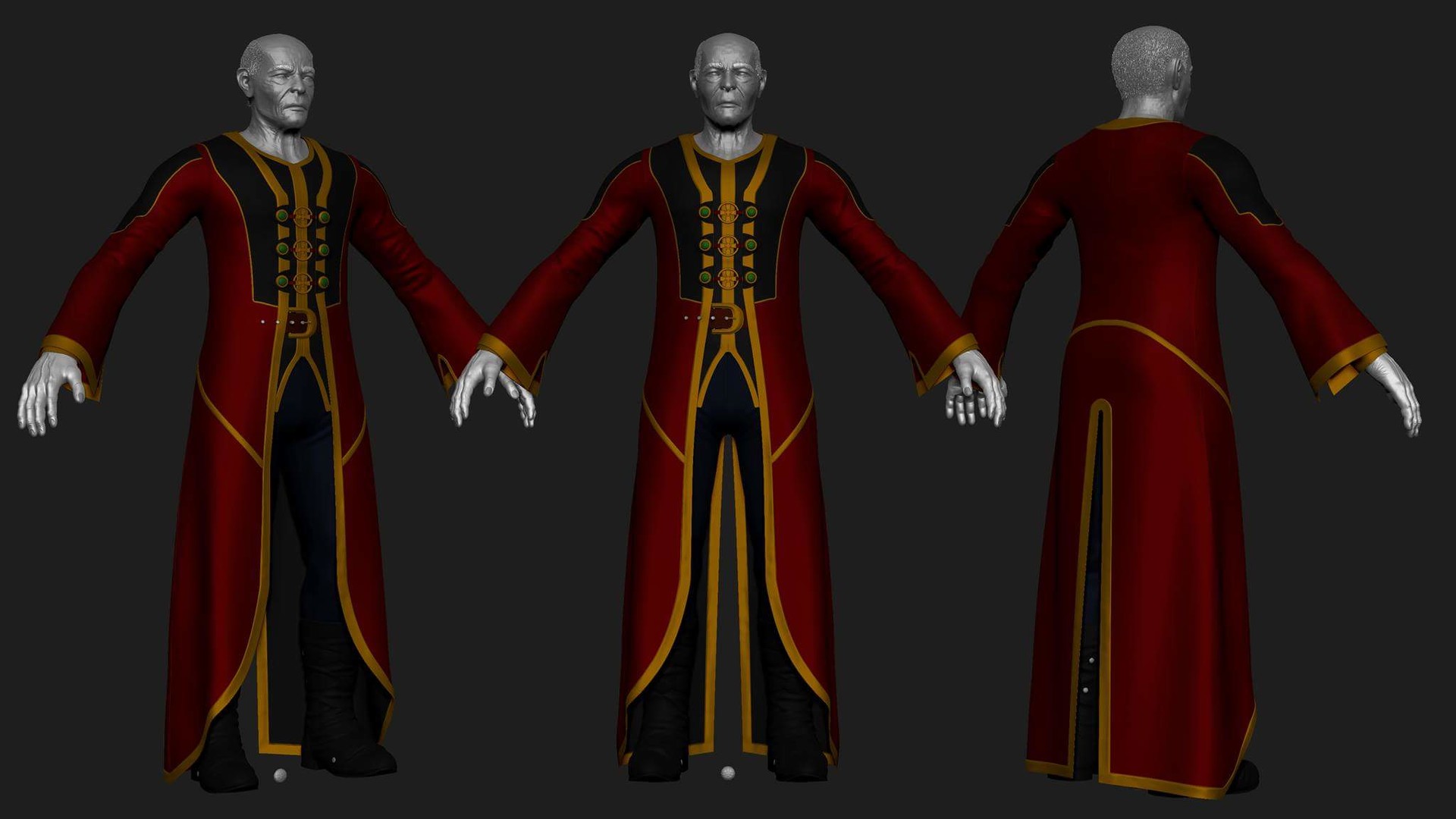
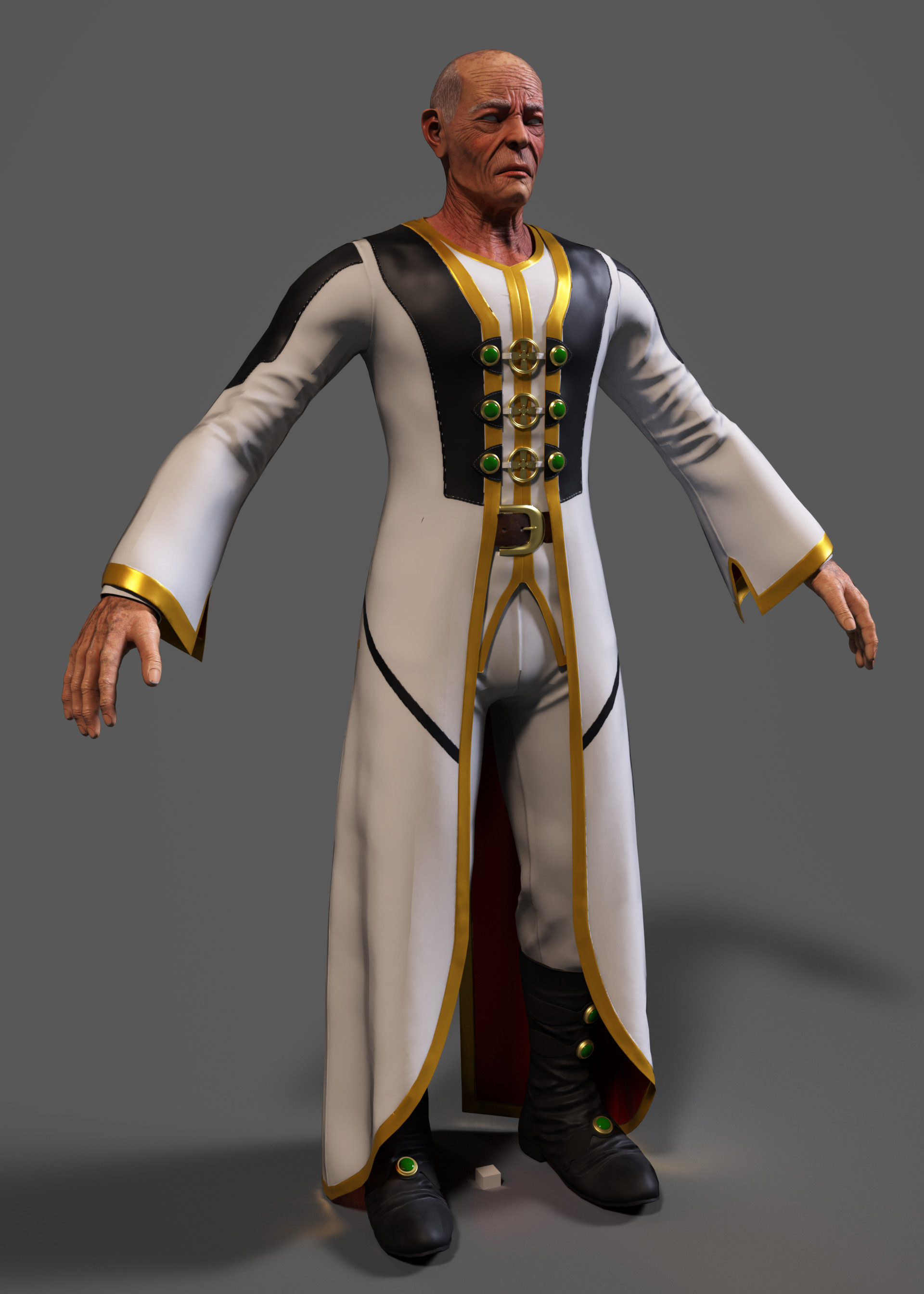
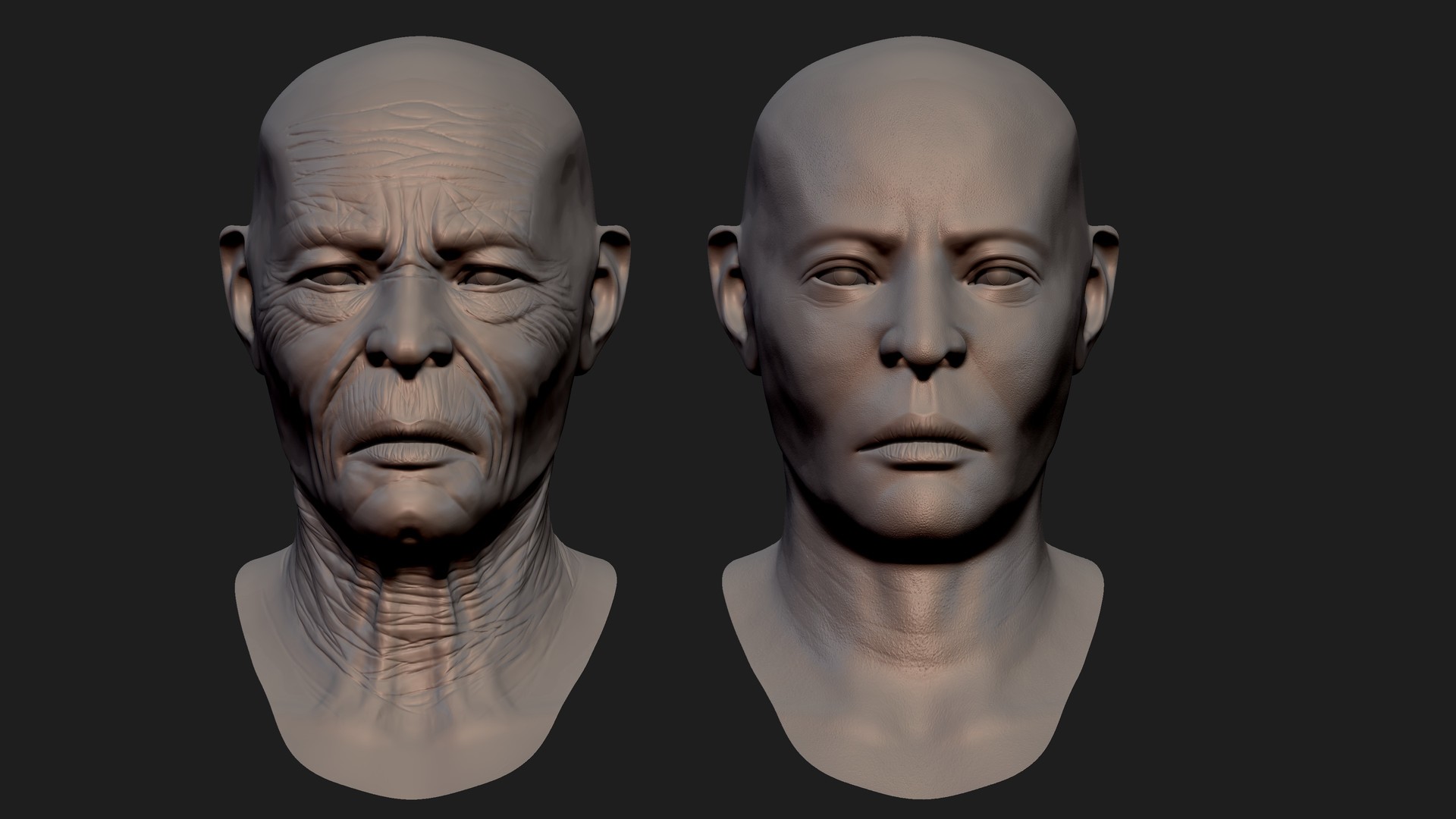
Hey, everyone, it has been a while since I've posted anything on my project (took time off to complete other milestones and to get my health in order) and I have a few things I would like to share with you. If you saw the last character, he is the third character in my game, and I wanted to really show off the amount of detail I have been able to put into the model. I also have his alternate design, which is supposed to be his much older and wiser appearance. I haven't added hair on either model, but that is coming.

I am also prepping my animation pipeline to include motion capture for the moves in the game, and I hope that will make the experience feel more fluid and down to earth. So I hope you enjoy the behind the scenes look at the newest fighter. I want to make one more before I put together a playable demo (upgrading to source so I can give AI to the characters)

Warlock Primary Costume

https://cdna.artstation.com/p/assets/images/images/006/116/032/large/kashif-riley-asset.jpg?1496162346

Archmage

https://cdnb.artstation.com/p/assets/images/images/006/792/165/large/kashif-riley-20424285-10154905430483786-4646384945357962460-o.jpg?1501264886

https://cdna.artstation.com/p/assets/images/images/006/124/208/large/kashif-riley-xavier-update-1.jpg?1496208765

https://cdnb.artstation.com/p/assets/images/images/007/247/873/large/kashif-riley-asset.jpg?1504752333

Young vs. Old

https://cdnb.artstation.com/p/assets/images/images/006/124/207/large/kashif-riley-zgrab04.jpg?1496208761

Current Iteration

So for my current update, I decided to go for a white and gold colour scheme to indicate a maturity and almost sage like appearance for an old man. I wanted to show his mastery of magic and the ability to control time and space. And I blocked in his scepter which will also have a feel of power.

https://www.dropbox.com/s/lg63r8ca8a22ppc/Screenshot%202017-09-06%2020.31.24.png?raw=1

https://www.dropbox.com/s/jgiwdympzd35p5m/Screenshot%202017-09-06%2020.32.01.png?raw=1

https://www.dropbox.com/s/gw9xp16bipgt90y/Screenshot%202017-09-06%2020.32.21.png?raw=1

https://www.dropbox.com/s/r3p7o8zsojwe47f/Screenshot%202017-09-06%2020.37.04.png?raw=1

The old colours. I liked them, but it felt too evil for a character who is traveling through time.

https://www.dropbox.com/s/kw05nk7rp64yvkr/Screenshot%202017-09-05%2020.30.22.png?raw=1


Texturing

https://www.dropbox.com/s/dsgi4gawjzednfi/Screenshot%202017-09-06%2022.55.42.png?raw=1

https://www.dropbox.com/s/m3vwk7uuofk35o4/Screenshot%202017-09-06%2022.55.47.png?raw=1

https://www.dropbox.com/s/ukk9fho5nmvxclu/Screenshot%202017-09-06%2022.55.55.png?raw=1

https://www.dropbox.com/s/vkiyw16guol27xz/Screenshot%202017-09-06%2022.56.08.png?raw=1

https://www.dropbox.com/s/pwxiw0fbush5hak/Screenshot%202017-09-06%2022.58.19.png?raw=1

https://www.dropbox.com/s/yyak1ilbtkvagse/Screenshot%202017-09-06%2022.58.16.png?raw=1


In Engine Roster so far

This is my roster so far. A few of these models will be getting updated textures and visuals tuned to a new shader system.

https://www.dropbox.com/s/wpb3wxfx48im8d6/Screenshot%202017-09-06%2022.48.46.png?raw=1

https://www.dropbox.com/s/wbi9qabsze63msc/Screenshot%202017-09-06%2022.48.52.png?raw=1

Don't pay mind to the guy in the grey textures. He will be getting a visual update in the coming weeks.